



ARTICLE CONTENTSOn this page 9 sections
Data Collection, Tables, Charts and Basic Economic Tools
Performance Objectives
By the end of the lesson, students should be able to:
- explain data collection methods;
- describe data using frequency distribution graph and tables;
- demonstrate changing raw data into info graphics;
- compute the measures of central tendency.
Introduction to Basic Economic Tools
In economics, understanding how economies work and making informed decisions requires careful study of information. This information is often in the form of data. Basic economic tools are methods and techniques used to collect, organise, analyse, and present economic data. These tools help economists, businesses, and governments understand economic situations, identify trends, and make better choices.
For example, a government might use these tools to understand unemployment rates, a business might use them to study customer preferences, and an individual might use them to compare prices before buying a product. The effective use of these tools leads to more accurate insights and more effective decision-making.
Data Collection
Data collection is the systematic process of gathering and measuring information on variables of interest in an established systematic fashion that enables one to answer stated research questions, test hypotheses, and evaluate outcomes. In economics, data collection is crucial for understanding economic phenomena, predicting future trends, and formulating policies.
Methods of Data Collection
There are various methods used to collect data, depending on the type of information needed and the resources available. Common methods include:
-
Observation: This method involves watching and recording behaviour or events as they occur. For example, an economist might observe consumer behaviour in a market or traffic patterns to understand transportation needs. Observation can be direct (watching in person) or indirect (using cameras or sensors).
-
Interviews: Interviews involve direct verbal communication between an interviewer and a respondent. This method allows for in-depth understanding and clarification of responses. Interviews can be structured (using a fixed set of questions) or unstructured (more like a conversation). For example, a researcher might interview farmers to understand their challenges or business owners about their sales.
-
Questionnaires: Questionnaires are a set of written questions used to gather information from a large number of respondents. They can be distributed in person, by mail, or online. Questionnaires are efficient for collecting data on opinions, attitudes, and facts. For instance, a company might use a questionnaire to survey customer satisfaction or a government agency to collect demographic information.
-
Experiments: In economics, experiments involve creating controlled situations to test specific hypotheses. For example, an economist might design an experiment to see how changes in price affect consumer demand for a product. This method is often used to establish cause-and-effect relationships.
-
Secondary Data Sources: This method involves using data that has already been collected and published by others. Examples include government publications (e.g., National Bureau of Statistics reports), academic journals, company reports, and news articles. Secondary data is often readily available and cost-effective, but its reliability and relevance must be carefully assessed.
Frequency Distribution
After collecting raw data, it is often unorganised and difficult to interpret. Frequency distribution is a way of organising raw data by showing how often each value or range of values appears in a dataset. It helps to summarise data and make it more understandable.
Creating a Frequency Distribution Table
A frequency distribution table lists each category or value and the number of times it appears in the dataset. The steps to create a frequency distribution table are:
-
Collect Raw Data: Start with a set of unorganised data. For example, consider the scores of 20 students in an Economics test out of 10 marks: 5, 7, 6, 8, 5, 9, 7, 6, 5, 8, 7, 10, 6, 9, 5, 7, 8, 6, 7, 5.
-
Identify Categories/Values: List all the unique scores or categories present in the data. In this example, the scores are 5, 6, 7, 8, 9, 10.
-
Tally the Frequencies: Go through the raw data and make a tally mark for each time a score appears. This helps in counting.
-
Count Frequencies: Count the tally marks for each score to get its frequency (how many times it occurred).
-
Construct the Table: Create a table with columns for the score, tally, and frequency.
Example: Economics Test Scores of 20 Students
| Score (Marks) | Tally | Frequency (Number of Students) |
|---|---|---|
| 5 | ||||| | 5 |
| 6 | |||| | 4 |
| 7 | ||||| | 5 |
| 8 | ||| | 3 |
| 9 | || | 2 |
| 10 | | | 1 |
| Total | 20 |
Tables and Charts
Tables and charts are powerful tools for presenting data in a clear, concise, and visually appealing way. They help in summarising complex information and highlighting important patterns or trends.
Tables
A table is a systematic arrangement of data in rows and columns. Tables are excellent for presenting precise numerical data and for making comparisons between different categories. They allow readers to quickly locate specific information.
Key features of a good table include:
- A clear and descriptive title.
- Clearly labelled rows and columns.
- Units of measurement specified.
- A source of data, if applicable.
The frequency distribution table shown earlier is an example of how tables are used to organise data.
Charts (Graphs)
Charts, also known as graphs, are visual representations of data. They are particularly useful for showing trends, comparisons, and relationships that might not be immediately obvious in a table. Different types of charts are suitable for different kinds of data and purposes.
Types of Charts
Common types of charts used in economics include:
-
Bar Charts: Bar charts use rectangular bars of varying heights or lengths to represent data for different categories. They are excellent for comparing quantities across distinct groups. For example, a bar chart can show the production of different crops in a state or the sales of different products in a month.
-
Pie Charts: Pie charts are circular charts divided into sectors, where each sector represents a proportion of the whole. They are best used to show how different parts contribute to a total. For instance, a pie chart can illustrate the percentage of a household budget spent on food, housing, and transportation.
-
Line Graphs: Line graphs use points connected by lines to show how a variable changes over time. They are ideal for displaying trends and patterns over a period. For example, a line graph can show changes in the price of a commodity over several months or years, or the growth of a country’s population over decades.
Describing Data using Frequency Distribution Graphs and Tables
To describe data using these tools, first create a frequency distribution table from raw data. Then, choose an appropriate chart type (e.g., bar chart for categories, line graph for trends over time, pie chart for proportions) to visually represent the frequencies or values. The visual representation makes it easier to identify the most common scores, the range of values, and any patterns in the data.
Infographics
Infographics are visual representations of information, data, or knowledge intended to present complex information quickly and clearly. They combine images, text, and data to tell a story or explain a concept in an engaging way. Infographics are particularly useful for making economic data accessible and understandable to a wider audience.
Changing Raw Data into Infographics
Transforming raw data into an infographic involves several steps:
-
Identify the Core Message: Determine the main point or story the data needs to convey. What is the most important insight from the raw data?
-
Select Key Data Points: Not all raw data can fit into an infographic. Choose the most relevant and impactful statistics or facts that support the core message.
-
Choose Visual Elements: Decide on appropriate charts (bar, pie, line), icons, images, and colours that will best represent the data and enhance understanding. For example, if showing population growth, an icon of people might be used.
-
Structure the Information: Organise the chosen data and visual elements in a logical flow. Infographics often have a title, an introduction, several data sections, and a conclusion or call to action.
-
Add Concise Text: Use minimal text to explain the visuals and provide context. The text should be clear, direct, and easy to read.
-
Design and Refine: Arrange all elements aesthetically. Ensure the infographic is visually appealing, easy to follow, and accurately represents the data. Tools like graphic design software or online infographic makers can be used for this step.
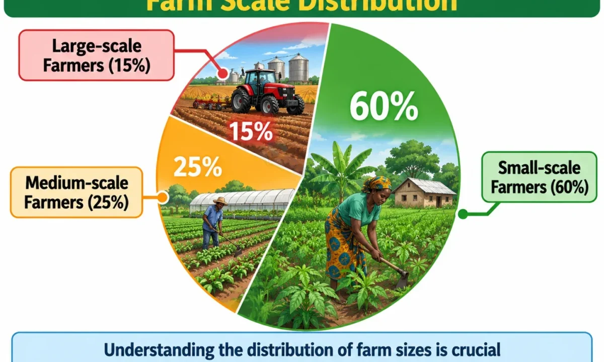
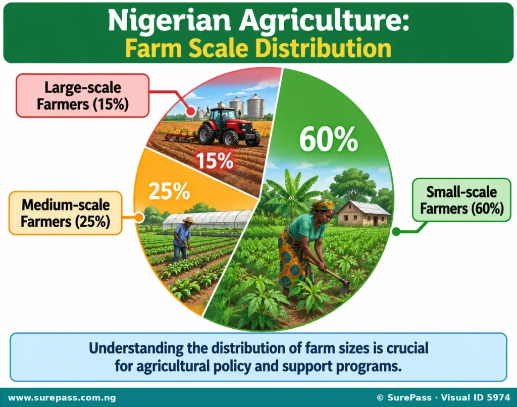
For example, if raw data shows that 60% of Nigerian farmers are small-scale, 25% are medium-scale, and 15% are large-scale, an infographic could use a pie chart to show these percentages, accompanied by small icons representing different farm sizes, and a clear headline about the structure of Nigerian agriculture.
Introduction to Measures of Central Tendency
Measures of central tendency are statistical values that describe the centre or typical value of a dataset. They provide a single value that represents the entire set of data, making it easier to understand and compare different datasets. The three most common measures of central tendency are the mean, median, and mode.
1. Mean (Arithmetic Mean)
The mean, often called the average, is calculated by summing all the values in a dataset and then dividing by the total number of values. It is the most commonly used measure of central tendency.
Formula:
Mean = (Sum of all values) / (Number of values)
Example:
Consider the monthly income (in Naira) of five traders: N50,000, N60,000, N45,000, N70,000, N55,000.
Sum of incomes = 50,000 + 60,000 + 45,000 + 70,000 + 55,000 = N280,000
Number of traders = 5
Mean income = 280,000 / 5 = N56,000
The average monthly income of the traders is N56,000.
2. Median
The median is the middle value in a dataset when the values are arranged in ascending or descending order. It is useful when there are extreme values (outliers) that might distort the mean.
Steps to compute the Median:
-
Arrange the data: Order the values from smallest to largest (or largest to smallest).
-
Find the middle value:
- If the number of values is odd, the median is the single middle value.
- If the number of values is even, the median is the average of the two middle values.
Example 1 (Odd number of values):
Consider the monthly income of five traders: N50,000, N60,000, N45,000, N70,000, N55,000.
1. Arrange in ascending order: N45,000, N50,000, N55,000, N60,000, N70,000
2. The middle value is N55,000.
Therefore, the median income is N55,000.
Example 2 (Even number of values):
Consider the prices of six different types of bread (in Naira): N300, N450, N350, N500, N400, N600.
1. Arrange in ascending order: N300, N350, N400, N450, N500, N600
2. The two middle values are N400 and N450.
3. Median = (400 + 450) / 2 = 850 / 2 = N425
Therefore, the median price of bread is N425.
3. Mode
The mode is the value that appears most frequently in a dataset. A dataset can have one mode (unimodal), more than one mode (multimodal), or no mode at all if all values appear with the same frequency.
Steps to compute the Mode:
-
Count frequencies: Determine how many times each value appears in the dataset.
-
Identify the most frequent value: The value with the highest frequency is the mode.
Example 1 (Single Mode):
Consider the scores of 20 students in an Economics test: 5, 7, 6, 8, 5, 9, 7, 6, 5, 8, 7, 10, 6, 9, 5, 7, 8, 6, 7, 5.
Counting the frequencies:
- Score 5: appears 5 times
- Score 6: appears 4 times
- Score 7: appears 5 times
- Score 8: appears 3 times
- Score 9: appears 2 times
- Score 10: appears 1 time
In this dataset, both 5 and 7 appear 5 times, which is the highest frequency. Therefore, the modes are 5 and 7 (bimodal).
Example 2 (No Mode):
Consider the ages of five friends: 15, 16, 17, 18, 19.
Each age appears only once. Therefore, there is no mode in this dataset.
Applying Economic Tools to Decision-Making
The economic tools discussed – data collection, frequency distribution, tables, charts, infographics, and measures of central tendency – are essential for making informed decisions in various economic contexts.
-
Understanding Market Trends: Businesses use data collection methods (like surveys) to gather information on consumer preferences. They then use tables and charts to visualise sales trends, customer demographics, and product demand. Measures of central tendency can help identify the average customer age or the most popular product, guiding decisions on product development, pricing, and marketing strategies.
-
Government Policy Formulation: Governments collect extensive data on economic indicators such as inflation, unemployment, and Gross Domestic Product (GDP). Frequency distributions and line graphs help to track these indicators over time, revealing patterns and potential problems. The mean income or median household expenditure can inform policies related to taxation, social welfare, and economic development programs.
-
Investment Decisions: Investors use economic data to decide where to put their money. They might analyse historical stock prices using line graphs to identify trends or compare the average returns (mean) of different investment options. Infographics can summarise complex financial reports, making it easier to grasp key investment opportunities or risks.
-
Resource Allocation: Households, businesses, and governments all face the challenge of allocating scarce resources. By collecting data on needs and available resources, and then presenting this data in tables or charts, decision-makers can identify priorities. For example, a family might chart its expenses to find areas where spending can be reduced or reallocated.
-
Evaluating Economic Performance: To assess the success of economic policies or business strategies, data is collected and analysed. For instance, a company might compare its average monthly sales (mean) before and after a new marketing campaign to determine its effectiveness. Infographics can then be used to present these results clearly to stakeholders.
By systematically collecting, organising, and analysing data using these tools, individuals and organisations can gain valuable insights, predict future outcomes, and make more rational and effective economic decisions.


0 comments
Open the discussion when you need it. Comments stay collapsed until requested so the initial article remains light.