


ARTICLE CONTENTSOn this page 8 sections
Basic Statistical Measures and Their Graphical Representations
Performance Objectives
By the end of the lesson, students should be able to:
- interpret basic statistical values;
- use simple data collection methods to gather data of event within their environment;
- use software tools to create appropriate graphical representation of data;
- identify trends and patterns in data;
- Interpret and draw conclusion from data.
Introduction to Data and Statistics
In the digital age, information is everywhere. From the number of students in a class to the prices of goods in the market, or the results of a football match, data surrounds us. To make sense of this vast amount of information, we use statistics.
Statistics is the science of collecting, organising, analysing, interpreting, and presenting data.
Data refers to facts, figures, or information collected for analysis. It can be numbers, words, measurements, observations, or even just descriptions of things.
Understanding basic statistical measures and how to represent data visually helps in making informed decisions and understanding various events in the environment.
Basic Statistical Concepts
To analyse data effectively, several basic statistical measures are commonly used. These measures help to summarise and describe the main features of a dataset.
Mean
The mean, also known as the average, is calculated by adding all the values in a dataset and then dividing the sum by the total number of values.
The mean represents the central value of a dataset. For example, if a student scores 70, 80, and 90 in three Digital Technologies tests, the mean score is (70 + 80 + 90) / 3 = 240 / 3 = 80.
Median
The median is the middle value in a dataset when the values are arranged in ascending or descending order.
If there is an odd number of values, the median is the single middle value. If there is an even number of values, the median is the average of the two middle values. For example, in the scores 70, 80, 90, the median is 80. If the scores were 60, 70, 80, 90, the median would be (70 + 80) / 2 = 75.
Mode
The mode is the value that appears most frequently in a dataset.
A dataset can have one mode (unimodal), more than one mode (multimodal), or no mode if all values appear with the same frequency. For instance, in the scores 70, 80, 80, 90, the mode is 80 because it appears twice, which is more than any other score.
Range
The range is the difference between the highest and lowest values in a dataset.
It provides a simple measure of the spread or variability of the data. For example, if the highest score in a test is 95 and the lowest is 55, the range is 95 – 55 = 40.
Percentages
A percentage is a way of expressing a number as a fraction of 100.
It is often used to show proportions or parts of a whole. To calculate a percentage, divide the part by the whole and multiply by 100. For example, if 15 out of 50 students passed an exam, the percentage of students who passed is (15 / 50) * 100 = 30%.
Data Collection
Before data can be analysed, it must first be collected. Data collection is the process of gathering information from various sources.
Data collection is the systematic process of gathering and measuring information on targeted variables in an established system, which then enables one to answer relevant questions and evaluate outcomes.
Methods of Data Collection
There are several methods for collecting data, depending on the type of information needed and the resources available. Two common methods are survey and observation.
-
Survey: This method involves collecting data by asking questions to a group of people. Surveys can be conducted through:
- Questionnaires: A set of written questions that respondents answer. These can be paper-based or digital (e.g., online forms). For example, a school might use a questionnaire to ask students about their favourite subjects.
- Interviews: Direct conversations with individuals to gather information. Interviews can be structured (with a fixed set of questions) or unstructured (more free-flowing). For instance, interviewing market traders about the prices of goods.
-
Observation: This method involves watching and recording behaviours, events, or characteristics without direct interaction with the subjects.
Observation can be done in natural settings or controlled environments. For example, counting the number of cars passing a specific point in an hour, or observing how students interact during group work.
Graphical Representation of Data
Once data is collected and summarised using statistical measures, it can be presented visually through graphs and charts. Graphical representation makes complex data easier to understand and helps in identifying patterns and trends quickly.
Graphical representation is the visual display of data using charts, graphs, and other visual elements to communicate information effectively.
The human brain processes visual information much faster than text or numbers. Therefore, graphs are powerful tools for communicating insights from data.
Types of Graphical Representations
Different types of graphs are suitable for different kinds of data and purposes. Common types include bar charts, histograms, pie charts, and scatter plots.
Bar Chart
A bar chart uses rectangular bars of varying heights or lengths to represent different categories of data.
Bar charts are ideal for comparing quantities across distinct categories. The length or height of each bar is proportional to the value it represents. For example, a bar chart can show the number of students who chose different sports in a school.
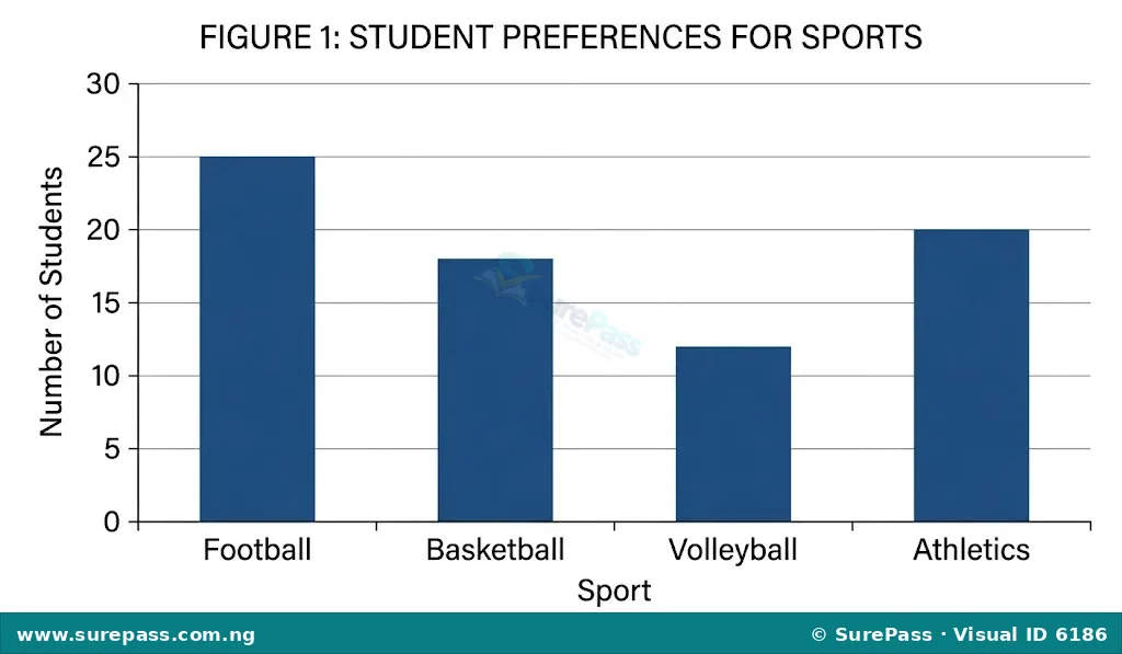
To interpret a bar chart, compare the heights or lengths of the bars. A taller or longer bar indicates a larger value for that category.
Histogram
A histogram is a graphical representation of the distribution of numerical data, where the data is divided into bins (intervals) and the height of each bar represents the frequency of data points falling into that bin.
Histograms are similar to bar charts but are used for continuous data, where the bars touch each other to show the continuous nature of the data. They are useful for showing the shape and spread of a dataset. For example, a histogram can show the distribution of student test scores, grouped into ranges like 0-10, 11-20, etc.
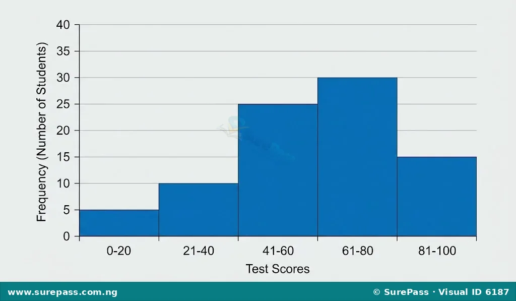
When interpreting a histogram, observe the shape of the distribution. A tall bar indicates a range with many data points, while a short bar indicates a range with fewer data points.
Pie Chart
A pie chart is a circular graph divided into slices, where each slice represents a proportion of the whole.
Pie charts are excellent for showing how different parts contribute to a total. The size of each slice is proportional to the percentage it represents. For example, a pie chart can show the percentage of a family’s budget spent on different categories like food, transport, and housing.
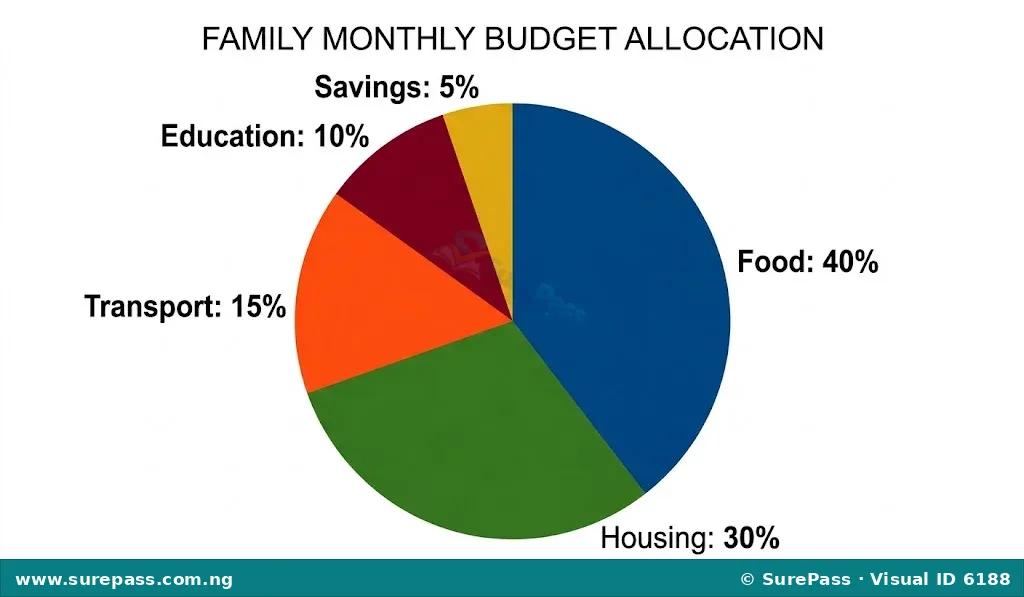
To interpret a pie chart, compare the sizes of the slices. A larger slice means a larger proportion of the total.
Scatter Plot
A scatter plot is a graph that displays the relationship between two numerical variables for a set of data.
Each point on a scatter plot represents a pair of values for the two variables. Scatter plots are useful for identifying correlations or trends between two variables. For example, a scatter plot can show the relationship between the number of hours students study and their test scores.
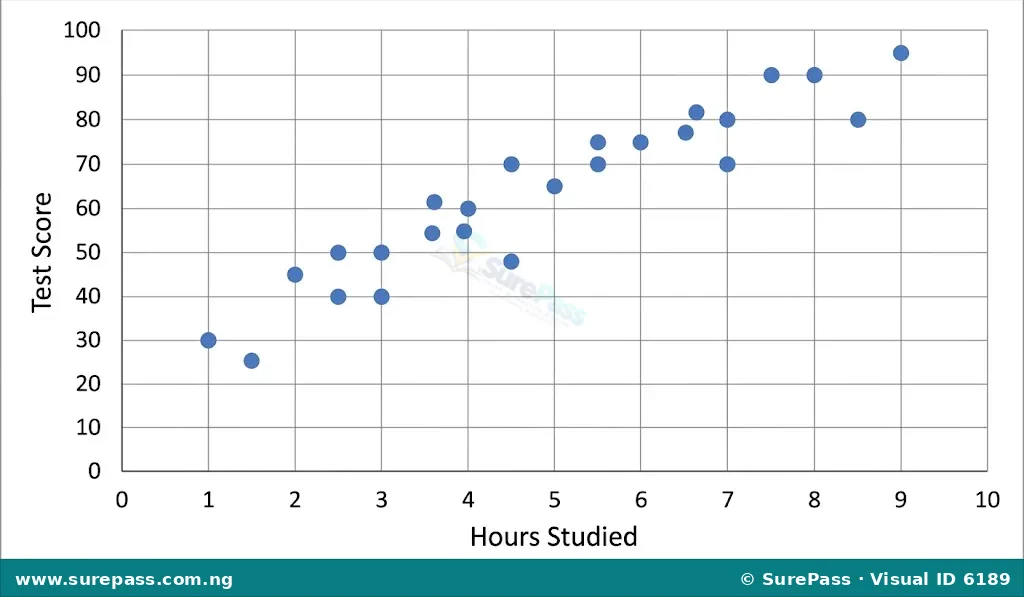
When interpreting a scatter plot, look for patterns in the distribution of points. If the points generally rise from left to right, it suggests a positive relationship. If they fall, it suggests a negative relationship. If they are scattered randomly, there might be no clear relationship.
Using Software Tools for Graphical Representation
Modern software tools, especially spreadsheet applications like Microsoft Excel or Google Sheets, make it easy to create various charts and graphs from raw data. These tools automate the process, allowing users to focus on data interpretation rather than manual drawing.
Introduction to Spreadsheet Software
Spreadsheet software organises data in rows and columns, forming a grid of cells. Each cell can contain numbers, text, or formulas. These applications have built-in charting features that can quickly convert selected data into visual representations.
Steps to Create a Bar Chart using Spreadsheet Software
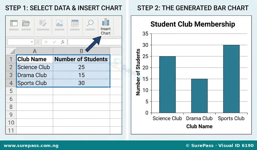
Consider a dataset showing the number of students in different clubs in a school:
- Enter Data: Open a spreadsheet program (e.g., MS Excel or Google Sheets). Enter the data into two columns. For example, Column A for “Club Name” and Column B for “Number of Students”.
Example Data:
- Debate Club: 30
- Science Club: 45
- Art Club: 20
- Drama Club: 35
- Select Data: Click and drag your mouse to select all the data, including the column headers.
- Insert Chart: Go to the “Insert” tab or menu. Look for the “Charts” group or option.
- Choose Chart Type: Select “Bar Chart” or “Column Chart” from the available options. The software will automatically generate a bar chart.
- Customise Chart (Optional): You can add a chart title (e.g., “Student Club Membership”), label the axes (e.g., “Club Name” for the horizontal axis and “Number of Students” for the vertical axis), change colours, and adjust other formatting options using the chart design tools.
Steps to Create a Pie Chart using Spreadsheet Software
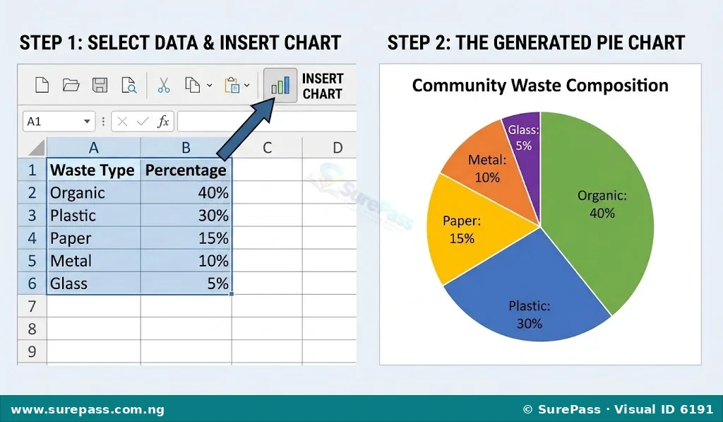
Consider a dataset showing the percentage of different types of waste collected in a community:
- Enter Data: Enter the data into two columns. For example, Column A for “Waste Type” and Column B for “Percentage”.
Example Data:
- Organic Waste: 50%
- Plastics: 25%
- Paper: 15%
- Metals: 10%
- Select Data: Select all the data, including the column headers.
- Insert Chart: Go to the “Insert” tab or menu. Look for the “Charts” group or option.
- Choose Chart Type: Select “Pie Chart” from the available options. The software will generate a pie chart.
- Customise Chart (Optional): Add a chart title (e.g., “Community Waste Composition”), add data labels to show percentages on each slice, and adjust colours or other formatting.
Interpreting Data and Drawing Conclusions
Creating charts is only the first step. The real value comes from interpreting the visual representations to understand the data and make informed judgments.
Identifying Trends and Patterns
Trends and patterns are regular changes or relationships observed in data. They help to understand how things are changing over time or how different factors are related.
- Trends: These are general directions or movements in data. For example, in a bar chart showing sales over several months, an upward trend indicates increasing sales, while a downward trend indicates decreasing sales. In a scatter plot, a cluster of points moving upwards from left to right shows a positive trend.
- Patterns: These are recurring sequences or designs in data. For instance, a pie chart might show that “Food” consistently takes the largest share of a family’s budget, which is a pattern of expenditure. A histogram might show that most student scores fall within the middle range, forming a common pattern of distribution.
Extracting Information from Data
Extracting information means identifying specific facts or figures from the charts. This involves carefully reading the labels, titles, and values presented in the graph.
For example, from a bar chart of student club membership, one can extract that the Science Club has the highest number of members (45), and the Art Club has the lowest (20). From a pie chart of waste composition, one can see that organic waste makes up 50% of the total.
Drawing Conclusions and Making Judgments
Drawing conclusions involves summarising what the data tells us, while making judgments means forming opinions or decisions based on these conclusions.
After identifying trends and patterns and extracting specific information, one can formulate conclusions. For example, if a bar chart shows a significant increase in the number of students choosing Digital Technologies over three years, a conclusion could be that “Digital Technologies is becoming increasingly popular among students.” A judgment based on this could be to “allocate more resources to the Digital Technologies department.”
It is important to ensure that conclusions and judgments are supported by the data and are not based on personal bias or assumptions.


0 comments
Open the discussion when you need it. Comments stay collapsed until requested so the initial article remains light.